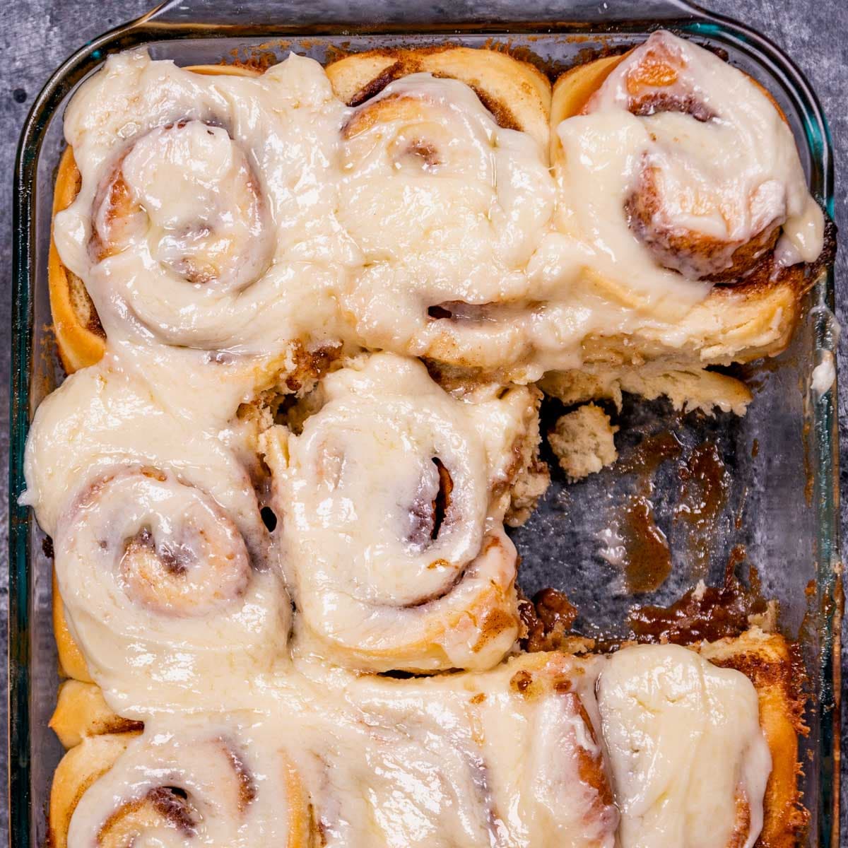
There’s nothing quite like the cherished tradition of eating homemade cinnamon rolls on Thanksgiving, Christmas morning or other special occasions. With a pillowy soft dough (similar to our milk bread), a rich cinnamon filling, and melt-in-your-mouth cream cheese frosting, these Cinnamon Rolls are unbeatable!
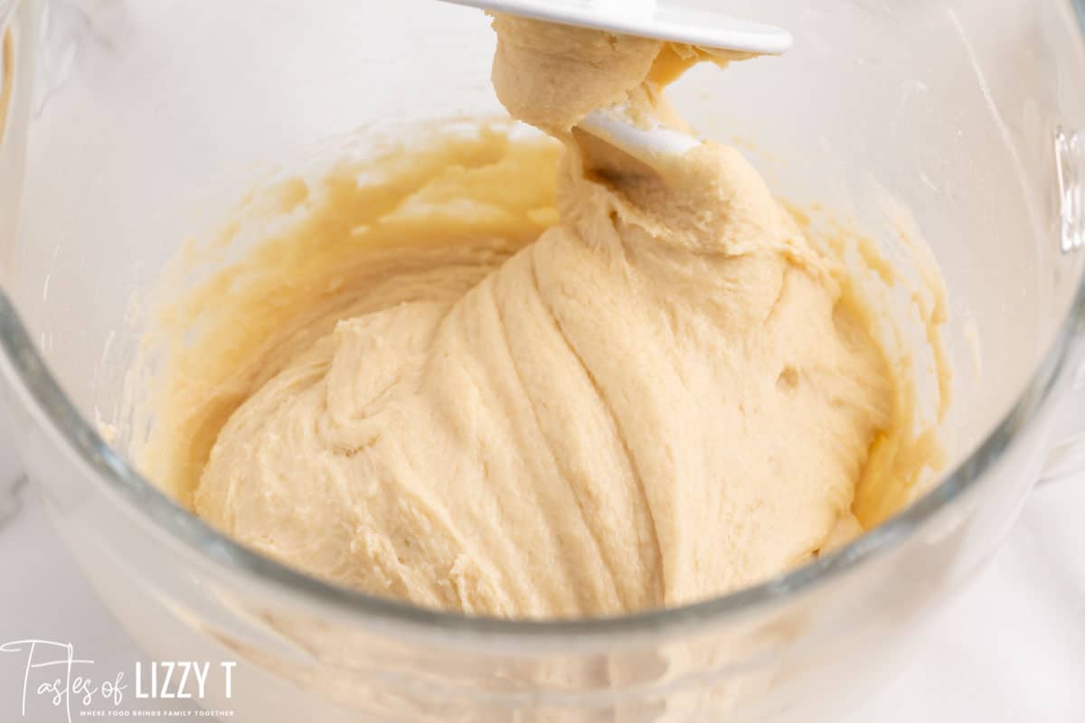
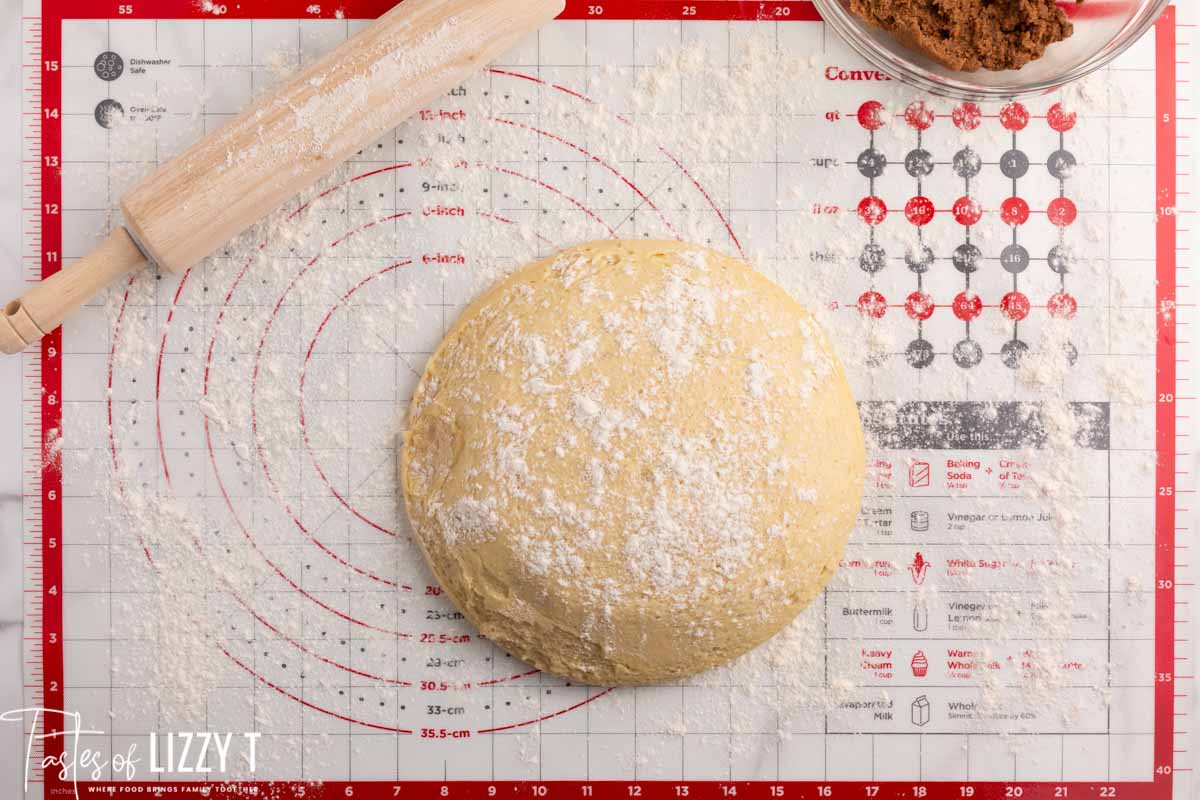
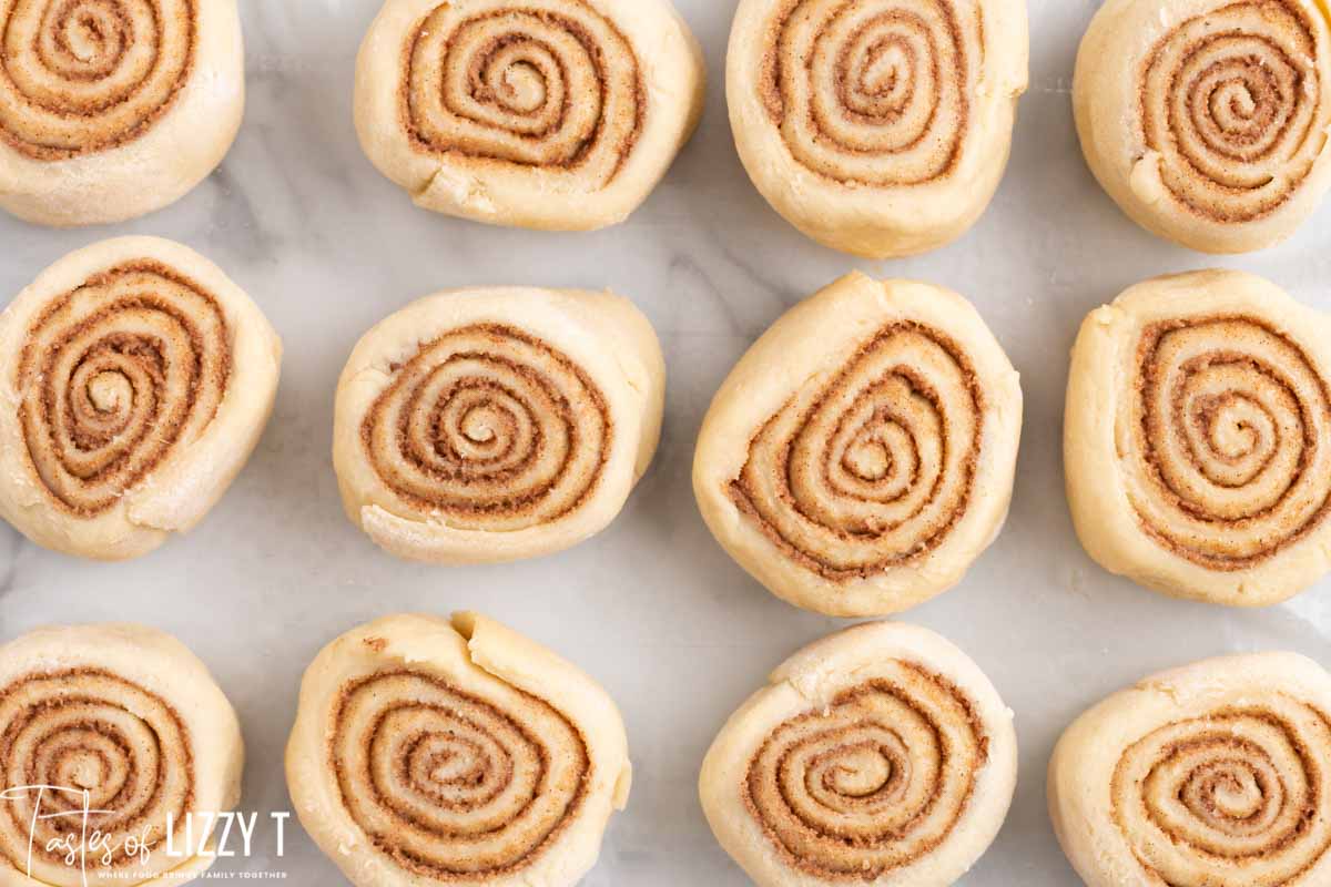
Dough
Filling
Frosting
Recipe adapted from Tastes of Lizzy
Sally's Baking I love the personalization she put on her website, with all the colors being cohesive and the patterning at the top of the screen. Outside of just visuals, I feel like it's a good reference because it's well organized, having real life testimonials in pink boxes, catching the eyes of users. Also, each step is accompanied with a photo, allowing users to follow along easily without being confused. However, if users don't want to look at extra descriptions and photos, if they scroll all the way down, there's a no-fluff recipe listed for them. I love this format because it caters to both types of users looking to use this recipe.
Ambitious Kitchen I felt that this recipe website showed some really great and not-so-easy to read qualities. For example, I love how they used a highlighting feature to emphsize certain phrases and/or words. However, I felt that because the website was in 2 different columns, it was a bit distracting to try to read the recipe as the Meet the Cook! and various ads were running on the right side of the screen. However, the right side of the column did end much earlier than the rest of the website, which is both good, as it stopped being distracting, but also bad, because now the two sides of the website are imbalanced, not being the same length.
the kitchn This cinnamon bun recipe website I honestly appreciated because it was much shorter and much more straightforward. Granted, there were less ads and less photos (which could be harder for users to follow along). However, the website opened up immediately with a video showing the recipe making in action, a touch that I love. Because the rest of the website is not so overwhelming, a moving video seems to be the perfect touch for this website.
ChiChi Chickpeas I absolutely love the playfulness of the website! Once you scroll on it, there are handdrawn graphics of snacks and food you could make with their product. I love the little artistic doodles here and there, while the website remains extremely vibrant while sticking within a restricted color palette.
Duolingo I love the simplicity of the Duolingo website. Most recipe websites have lots of clutter, whether it be stories, ads, promotions, or other recipes on the side, making it harder for the user to find and read the recipe. Following Duolingo's simple recipe, it's easy to follow, cohesive, and still has plenty of engaing graphics.
Tesla I like how tesla's website opens with a short montage and video running showcasing Teslas. I think a video where there is still enough contrast to read words on top of it while it shows the yummminess and ease of the recipe is a great idea!